top of page

mobile web browser: Zara is a Spanish fast-fashion retailer known for quickly producing trendy, affordable clothing inspired by high-end runway designs.
user: Me!
pain points:
1. Confusing layout
2. Some specific aspects of poor accessibility, though Accessibility is very good overall, (unlabeled / confusing iconography)
3. Item selection - excessive scrolling, skipping conventions
4. Hidden clothing sizes
case study - zara (online retailer)
the issue: confusing layouts, unlabeled iconography, help that is hidden

1. disjointed scroll/layout pattern I wasn’t sure if that sweater in the middle was an ad, and then I didn’t realize that I was supposed to keep scrolling - I thought that was the last sweater available since there is no indication of what page you’re on/how many more items are left, as well as the aforementioned break in the layout. Also the dividing line. Very confusing.
2. Nebulous/unlabeled iconography. Missing key Accessibility guidelines Not sure what certain icons mean = guessing = frustration
*Zara does offer an option to adjust Accessibility settings on the page including color contrast, font size, line spacing, word spacing, letter spacing and video captioning! Their icons are still missing labels. After clicking through some of the icons, it seems like there are actually a lot of options to assist with page navigation and viewing preferences! Unfortunately, the user doesn’t know that unless they click through the icons blindly.
Tiny colored box to show what colors are available for the item. One again, the icon is unlabled and if it’s just a black box with a +1 (one additional color, black), there’s really no context at all as to what that means.

3. Skipping conventions:Traditionally, in the world of online shopping, most online stores showcase multiple views/photos of the selected item in a carousel. The user can just swipe through without scrolling down the page at all. Zara forces the user to scroll down and view one image at a time. This seems less cohesive and personally took me out of the experience. I want to be able to quickly flip back and forth through photos of the item I’m looking at.
1.


2.
4. Non-intuitive steps The available sizes of the clothing item are hidden and require an extra step for the user to find. Traditionally the available sizes are listed with the item itself. Zara requires the user to click an unlabeled [ + ] icon to see the available sizes (example 1), OR for Example 2, the user cannot see the sizes until they add the item to their cart. Why would I add an item to my cart when I don’t know the size? I am usually a size XS - it took me several steps (completing all the steps shown in Example 2) just to find out that Zara does not even carry my size.
proposed solutions: label your icons, and don't skip the conventions
1. label your icons, use traditional iconography or remove the ones that are confusing.Don't force users to click to find clarity. If they can't find it, they will leave.
2. return to conventions:Conventions, though they can often come off as “boring” create clarity for users. Clarity reduces possible friction while navigating a site. In the online shopping space, for example, the different views/photographs of an item when selected, should be easy to access and move through. Most online shops showcase their item view photographs in a carousel.
*Note: If a user tries to swipe through the photos of an item like they would on a different/more traditional website, the swiping action actually leads the user to a completely different item.
1. proposed changes: several BUTTON/ICON updates


1. Changed the unlabeled [+] icon to 2 new buttons, clearly labeled, to indicate the available sizes and colors.

2. Changing the bookmark icon to a more traditional heart icon for saving favorite items
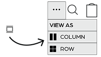
3. Adding a simple dropdown menu with the options for page view preferences. currently there is just a tiny icon with no context.

4. Lastly, in order to follow the Accessibility principle of Visibility of System Status, I have added a page indicator at the bottom of the screen so the user knows what page they're on and how many are available.

2. THE CAROUSEL
bottom of page